What is a Forex Chart?
A forex chart is a visual tool that tracks the price movement of a currency pair over time. It displays essential trading data like opening, closing, high, and low prices for each time frame, helping traders analyze trends and identify chart patterns. Forex trading charts can be viewed in different formats, such as line, bar, or candlestick. They are used to interpret price action, spot support and resistance levels, and make informed trading decisions.
How to Read Forex Chart?
A forex chart visually displays the price action of a currency pair over time, helping traders spot market trends, chart patterns, and entry/exit opportunities. To read a forex chart, start by identifying three key elements:
1. Identify the Timeframe
First, check the period you are viewing. Whether you are looking at minutes (M5, M15), hours (H1, H4), or days (D1), each "bar" or point on the graph represents that specific amount of time.
2. Choose Your Chart Type
Switch your view to Candlesticks. While line charts are simple, candlesticks provide the most data: Open, High, Low, and Close prices at a single glance.
3. Spot the Trend
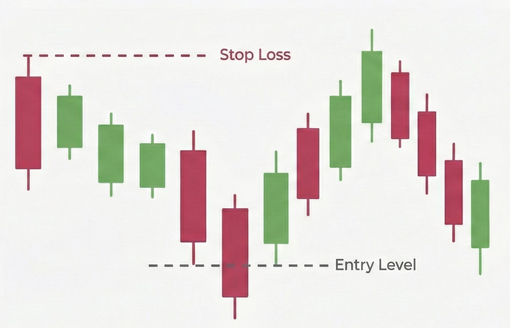
Look at the chart from left to right. Ask yourself if the price is making Higher Highs (an Uptrend) or Lower Lows (a Downtrend).
Understanding Price and Time in Forex Charts
Every forex trading chart, regardless of the broker or platform, is built on two coordinates.
Y-Axis (Vertical)
The Y-Axis (Vertical) represents the Exchange Rate, or price. The higher the graph goes, the more expensive the currency pair is becoming. For example, if you are looking at EUR/USD and the chart moves up, the Euro is gaining value against the Dollar.
X-Axis (Horizontal)
The X-Axis (Horizontal) represents Time. The further right you go, the more current the data is. The furthest point to the right shows the current live price action.
The 3 Types of Forex Charts
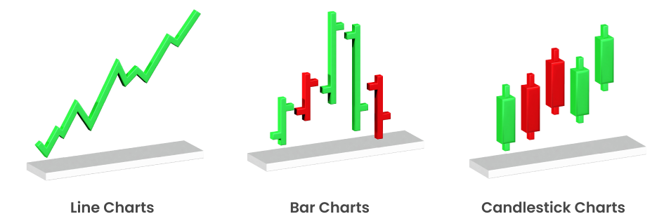
Line Charts
This is the simplest form of charting. It draws a continuous line connecting one closing price to the next closing price. Line charts are excellent for seeing the "big picture" trend without market noise, but they have a major weakness: they hide what happened during the timeframe, effectively filtering out volatility.
Although line charts are not commonly used by advanced traders for detailed analysis, they have found renewed relevance in swing trading and position trading, where traders are more focused on the broader direction of the market rather than short-term price action. Many long-term investors use line charts with other chart types to identify overall market trends.
Bar Charts (OHLC)
The Bar chart is often called the OHLC chart because it displays the Open, High, Low, and Close for a specific period. The vertical line shows the trading range (High and Low), while a horizontal notch on the left indicates the Opening price, and a notch on the right indicates the Closing price.
With the rise of quantitative and algorithmic trading strategies, bar charts are used extensively for backtesting and developing trading algorithms that rely on intraday volatility and price fluctuations. Bar charts provide the raw data for calculating volatility, moving averages, and other indicators commonly used in advanced trading systems.
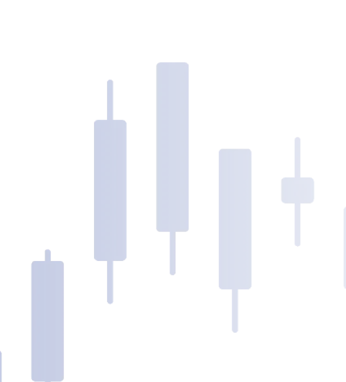
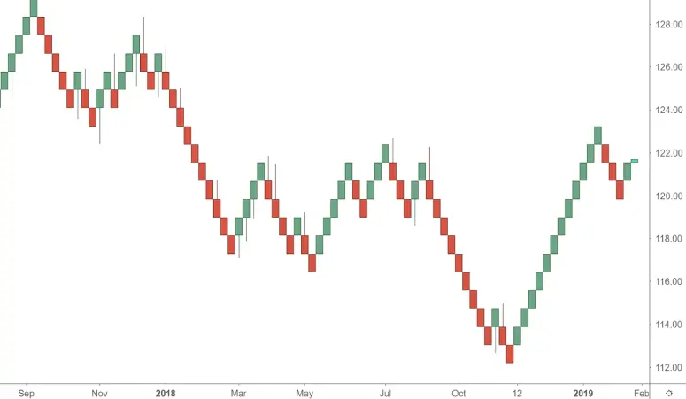
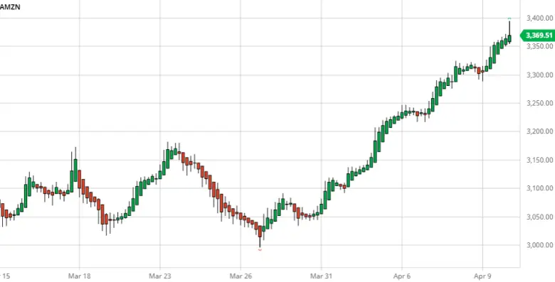
Candlestick Charts
Used by the vast majority of professional traders, Japanese Candlestick charts provide the exact same data as Bar charts but are visually superior. They are color-coded—usually Green/Red or White/Black—to instantly show if the price went up or down during that period.
Combining candlestick charts with technical indicators such as the Relative Strength Index (RSI) or Moving Averages further enhances their effectiveness for forex day trading and swing trading.
Why Are Forex Charts Different?
A common question new traders ask is "why are forex charts different?" The answer lies in the level of detail provided for decision-making.
| Chart Type | Best For | Pros | Cons |
|---|---|---|---|
| Line Chart | Big Picture Trends (Macro) | Simple, removes market "noise" | Hides price gaps and volatility |
| Bar Chart (OHLC) | Detailed Analysis | Shows the full trading range | Harder to read visually |
| Candlestick Chart | Trading Decisions (Micro) | Instantly shows market emotion (Bulls vs Bears) | Can be overwhelming for total beginners |
Advanced Chart Types Gaining Popularity
While the three traditional chart types — line, bar, and candlestick — remain the most commonly used, advanced traders are increasingly adopting other types of charts, such as:
Renko Chart
Focus on price movement rather than time. Each "brick" represents a specific price movement, filtering out small price fluctuations and helping traders focus on the overall trend.
Heikin-Ashi Chart
A variation of candlestick charts that smooth out price fluctuations by using modified open-close data, making it easier to spot trends and reversals.
Point and Figure Charts
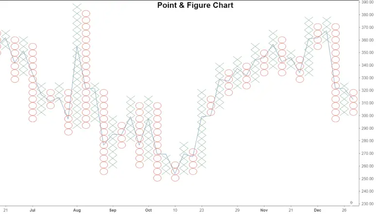
These charts plot price movements without considering time, using "X" and "O" to show price increases and decreases. This chart type is particularly useful for identifying long-term support and resistance levels.
While these advanced chart types are not as widely used as candlestick or bar charts, they are growing in popularity due to their ability to simplify complex price movements and reduce market noise.
How to Choose the Right Forex Chart?
Choosing the right chart depends on your trading style, the level of detail you need, and the time frame you are analyzing. Here’s a quick guide:
- Line Charts: Line charts are perfect for beginners or traders focusing on the bigger picture.
- Bar Charts: Bar charts offer more detail and are suited for traders analyzing short-term volatility.
- Candlestick Charts: Candlestick charts are ideal for technical analysis, especially for those who want to identify patterns and market sentiment.
For more advanced traders, incorporating Renko, Heikin-Ashi, or Point-and-Figure charts can add depth to their analysis and help identify hidden market trends.