什么是外汇图表?
外汇图表是一种 可视化工具,用于跟踪货币对在特定时间段内的 价格走势。
它显示每个时间周期的关键交易数据,如 开盘价、收盘价、最高价和最低价,帮助交易者分析趋势并识别图表形态。
外汇交易图表可以以不同形式查看,例如 折线图、柱状图 或 蜡烛图。
它们用于 解读价格走势,发现 支撑位与阻力位,并辅助做出更明智的交易决策。
如何阅读外汇图表?
外汇图表以视觉方式展示货币对的价格走势,帮助交易者识别 市场趋势、图表形态 以及 入场/出场机会。要学会阅读外汇图表,首先要明确三个关键要素:
货币对
图表标题(如 EUR/USD)显示货币对,前面的为 基础货币,后面的为 报价货币,它告诉你购买 1 个单位基础货币需要多少单位报价货币。
价格刻度(纵轴)
纵轴显示 价格数值,反映基础货币相对于报价货币的波动情况。
时间周期(横轴)
大多数外汇交易图表使用 蜡烛图,每根蜡烛线代表一个时间周期(例如 1 小时)内的价格变动,包括 开盘价、最高价、最低价和收盘价(OHLC)。
识别常见的外汇图表形态,如 双顶、旗形 或 三角形,有助于提前预测潜在的市场走势。
掌握如何阅读外汇图表是理解 价格行为、提升 技术分析能力 并 做出更明智交易决策 的基础。
外汇图表的类型
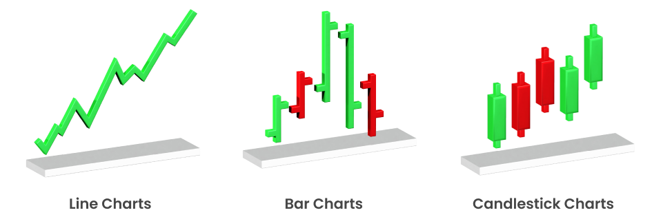
#1 折线图(Line Charts)
折线图是最简单直观的外汇图表类型。它通过一条连线,将某一货币对在特定时间段内的 收盘价 连接起来。这种简洁性使折线图非常适合新手,因为它只关注收盘价,而收盘价被许多外汇交易者视为 最重要的数据点。
主要特点:
关注收盘价
提供整体价格走势的清晰图像,不受日内价格波动“噪音”的干扰。
适合长期趋势分析
由于剔除了日内波动,折线图可用于识别更长周期的市场趋势。
易于阅读
为外汇交易新手提供简洁明了的市场视图。
虽然折线图不常被高级交易者用于深入分析,但在 波段交易和 持仓交易 中重新获得了重要性,因为这些交易者更注重市场的 总体方向 而非短期价格行为。许多长期投资者会将折线图与其他图表结合使用,以识别整体市场趋势。
#2 柱状图
柱状图,也称为 OHLC 图(Open-High-Low-Close),相比折线图提供了 更丰富的信息。每一根柱子代表特定时间段(如 1 天或 1 小时)内的价格波动,并显示 开盘价、最高价、最低价和收盘价。
主要特点:
OHLC数据
四个数据点为交易者提供更全面的市场活动视图,帮助理解价格在每个时间段的变化。
方向指示
柱状图通常用颜色或阴影标示价格的上涨或下跌(绿色代表上涨,红色代表下跌)。
波动性分析
柱子的长短显示了该时间段的市场波动幅度,更容易识别高活跃或低活跃时期。
随着 量化交易 和 算法交易策略的兴起,柱状图被广泛用于 回测 和开发依赖日内波动及价格波动的交易算法。
柱状图为计算 波动率、移动平均线 和其他高级交易系统常用指标提供了基础数据。
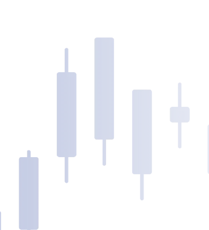
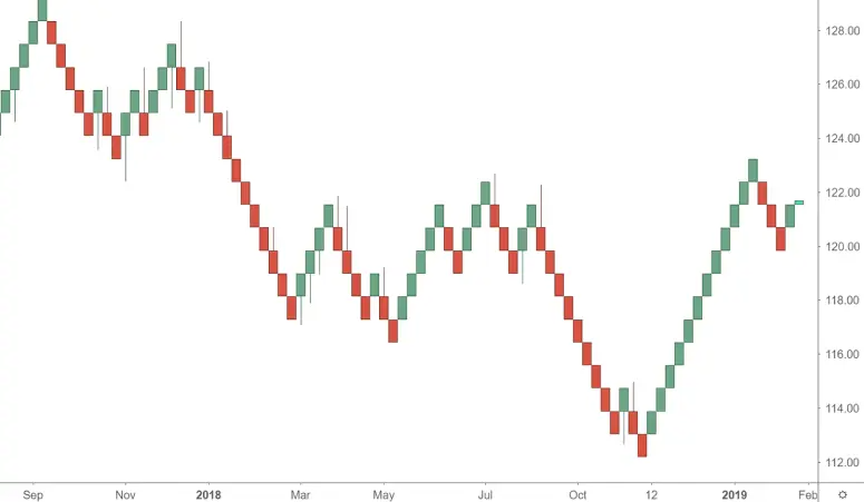
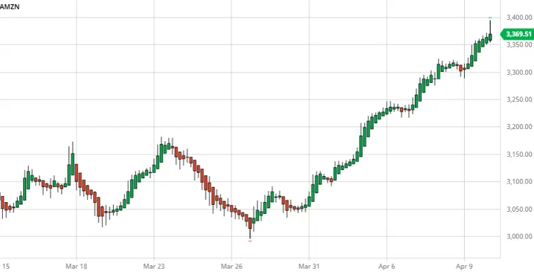
#3 蜡烛图
蜡烛图是当今外汇交易中 最常用 的图表类型,以 直观且信息丰富的方式 展示市场数据。每一根蜡烛代表特定时间段内的 开盘价、收盘价、最高价和最低价,与柱状图相似,但呈现方式更具视觉冲击力和细节性。
主要特点:
颜色标识
蜡烛通常通过颜色来显示收盘价高于或低于开盘价(绿色代表看涨,红色代表看跌)。
形态识别
蜡烛图形态(如 十字星 Doji、锤子线 Hammer、吞没形态 Engulfing)常用于预测市场反转或趋势延续。
心理洞察
蜡烛的实体和影线长度揭示了市场情绪 —— 多头或空头在该时间段内的主导地位。
蜡烛图已成为外汇交易的首选,尤其随着 技术分析工具 和 技术指标 的广泛使用。
许多现代 交易平台(包括 TMGM)都提供 高级蜡烛图形态识别软件,让交易者能够基于蜡烛图形态 自动化部分交易策略。
将蜡烛图与 技术指标(如 相对强弱指标(RSI) 或 移动平均线 结合使用,能进一步提升其在 外汇日内交易和 波段交易 中的效果。
高级图表类型日益受欢迎
虽然 折线图、柱状图和蜡烛图 仍是最常用的三大传统图表类型,但越来越多的高级交易者开始采用其他图表类型,例如:
砖形图
专注于价格走势而非时间。每一个“砖块”代表一次特定的价格变动,能够过滤掉细小的价格波动,帮助交易者聚焦于整体趋势。
平均足图
蜡烛图的一种变体,通过使用经过调整的开盘价与收盘价数据来平滑价格波动,使交易者更容易识别趋势与反转。
点数图
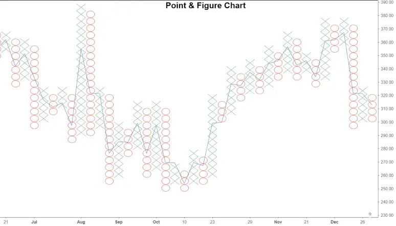
这些图表在绘制价格走势时不考虑时间因素,使用 “X” 和 “O” 来表示价格的上涨与下跌。此类图表对于识别长期支撑位与阻力位特别有用。
虽然这些高级图表类型的使用率不如蜡烛图或柱状图高,但凭借其 简化复杂价格走势 与 减少市场噪音 的优势,正逐渐受到越来越多交易者的青睐。
如何选择合适的外汇图表?
选择哪种图表取决于 您的交易风格、所需的细节程度 以及 您分析的时间周期。以下是简要指南:
- 折线图:非常适合 初学者 或专注于 整体趋势 的交易者。
- 柱状图:提供更多细节,适合分析 短期波动性 的交易者。
- 蜡烛图:最适合 技术分析,尤其适合想要识别 图表形态 和 市场情绪 的交易者。
对于更 高级的交易者,将 砖形图、平均足图 或 点数图 纳入分析,可以让研究更深入,并帮助识别 潜在的隐藏市场趋势。