


What is Trading Chart in Forex?
A trading chart in forex is a visual record of how a currency pair such as USD INR or EUR USD has moved over a chosen period. Each point, bar, or candle shows how price behaved in that slice of time so beginners can quickly see whether the market is moving up, down, or sideways.
Most platforms show the pair name at the top, a vertical price scale, and a horizontal time scale that you can set from one minute to one month or more. Once you are comfortable with these parts it becomes easier to link what you see on the screen with your trading plan.
How Do You Read A Trading Chart Step By Step?
To read a trading chart in trading you first identify the trend, then read each candle or bar, and finally check extra context such as timeframe and volume. This routine helps Indian beginners avoid guessing.
Identifying the Trend
Uptrend means price keeps making higher highs and higher lows, while a downtrend is the opposite.
Sideways movement means price is bouncing inside a range between support and resistance.
Read the Price Data
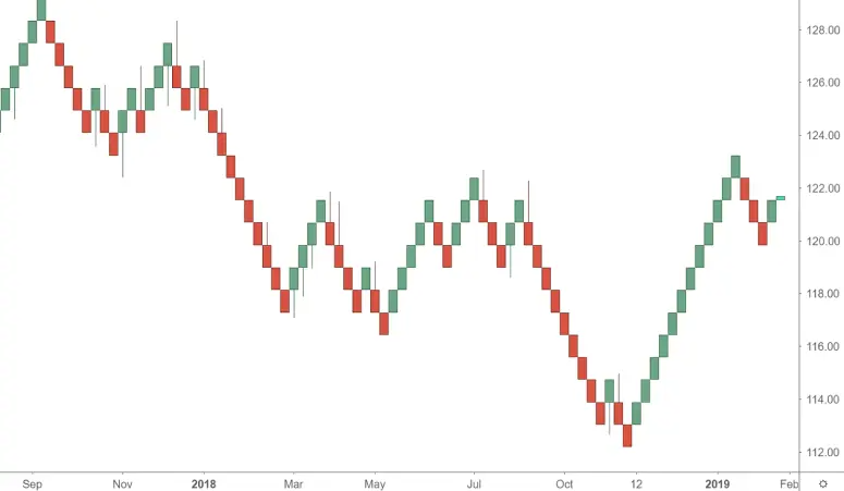
Each candle or bar on a forex trading chart shows the open, high, low, and close for that period.
Green or white bodies usually show that price closed higher than it opened while red or black bodies show the opposite.
Check Extra Factors
Timeframe: intraday charts help very active traders, while daily and weekly charts suit people who hold positions for longer.
Trading chart patterns: shapes such as triangles, flags, or double tops can hint at possible breakouts or reversals.
Types of Forex Charts
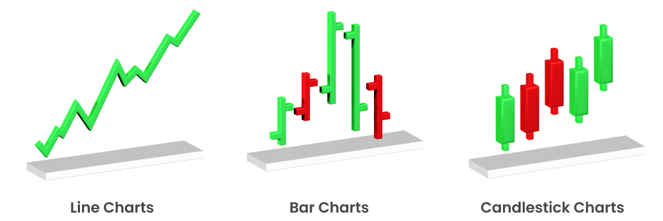
Types of forex charts show the same price action in different ways, so beginners can choose the view that suits their style. Most Indian traders start with line charts, bar charts, and candlestick charts before exploring advanced formats.
Line Charts The Simplest Forex Trading Chart
Line charts are the cleanest type of forex trading chart and are ideal for beginners who want to see the big picture. A line chart connects closing prices for a currency pair over time, which removes much of the intraday noise.
Key Features of Line Charts
Focus on Closing Prices
Provides a clear picture of overall price movement without the noise of price fluctuations during the day.
Ideal for Long-Term Trend
Since they eliminate intraday volatility, line charts are useful for identifying longer-term trends.
Although line charts are less common among advanced traders for detailed analysis, they remain valuable in swing trading and position trading, where the broader trend is more important than short-term fluctuations. Many long-term investors in India also use line charts alongside other forex trading charts to confirm overall market direction.
Bar Chart For Detailed Price Action
Bar charts, also called open high low close charts, give more detail than a simple line. Each bar shows the high and low of the period with small marks for the open and close, so you can see how price moved within that candle.
Key Features of Bar Charts
OHLC Data
Show four price points open, high, low, and close for each period.
Direction Indicators
Bars are color-coded or shaded to show whether the price has risen or fallen over the period (green for up, red for down).
Volatility Analysis
Make it easier to judge volatility because longer bars mean larger swings.
With the increasing use of quantitative and algorithmic strategies in India’s trading community, bar charts have become vital for backtesting and building models that depend on intraday volatility. They also provide raw data for calculating moving averages, volatility levels, and other indicators used alongside tools like the candlestick chart pattern to refine trading strategies.
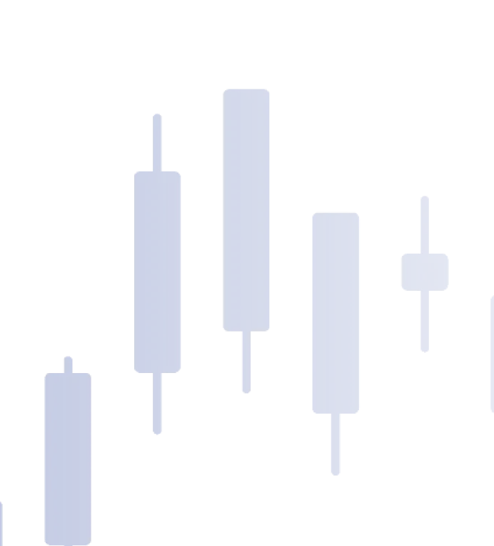
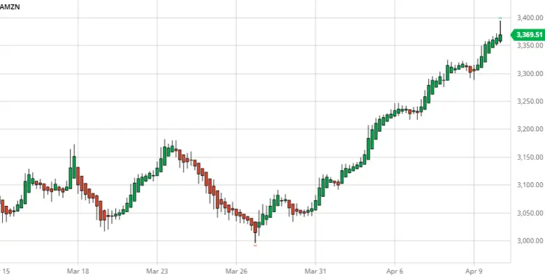
Candlestick Charts For Clear Market Sentiment
Candlestick charts are the most popular forex trading chart among active traders in India because they are simple to read yet full of information. Each candle has a body and wicks and uses color to show whether buyers or sellers were in control during that period.
Key Features of Candlestick Charts
Color-Coded Candles
Each color-coded to indicate whether the market closed higher or lower than it opened. Typically, green candles show bullish movement while red candles reflect bearish sentiment, helping traders quickly assess direction on trading chart.
Pattern Recognition
Candle shapes combine into well known trading chart patterns such as engulfing candles or morning star formations used in chart pattern trading.
When you add indicators such as moving averages or the relative strength index on top of candlestick charts you get a strong view for short term and swing trading.
Due to their intuitive nature, candlestick charts have become the standard in forex chart analysis. Many trading platforms, including TMGM, offer advanced candlestick recognition tools that allow traders to automate strategies based on candlestick signals.
When you combine candlestick charts with technical indicators like Relative Strength Index (RSI) or Moving Averages, candlestick charts become even more powerful for day trading and swing trading. By mastering the candlestick chart pattern, traders can refine their strategies and gain a clearer edge in the forex market.
Are There Advanced Trading Chart Types For Experienced Traders?
For most beginners in India the best trading chart to start with is a candlestick chart on the four hour or daily timeframe, backed by a line chart for long term context. Candles give enough detail to plan entries and exits, while the line chart keeps you aware of the main trend and major support and resistance zones.
Renko Chart
Focus on price movement rather than time. Each "brick" represents a specific price movement, filtering out small price fluctuations and helping traders focus on the overall trend. This makes Renko charts useful for spotting long-term forex chart patterns without distraction.
Heikin-Ashi Chart
A variation of candlestick charts that smooth out price fluctuations by using modified open-close data, making it easier to spot trends and reversals.
Point and Figure Charts
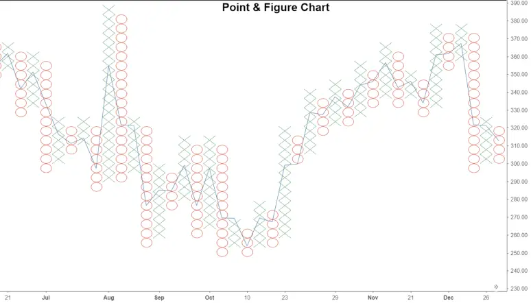
These charts plot price movements without considering time, using "X" and "O" to show price increases and decreases. This chart type is particularly useful for identifying long-term support and resistance levels.
Although these advanced chart types are not yet as common as bar or candlestick charts, their ability to filter out short-term fluctuations and highlight broader forex chart patterns has made them increasingly valuable for Indian traders. As more platforms adopt these tools, they are becoming an important complement to traditional forex charts for building advanced trading strategies.
Why Do Trading Chart Patterns Matter?
Trading chart patterns matter because they provide a structured way to read crowd behaviour instead of reacting to every tick. Over time shapes such as ranges, breakouts, and reversal patterns have become common tools in chart pattern trading.
Trading Chart in a Nutshell
A trading chart is the main map that helps Indian forex traders see how price has moved and decide what to do next. By understanding the basic parts of a forex trading chart, practising a simple routine for how to read chart in trading, and choosing the chart type that fits your style, you can turn raw price movement into clearer trading ideas while staying aware that all trading involves risk.